10 Shopify Product Page Optimizations That Increase Conversions in 2026
Your product page is where buying decisions are made. These 10 optimizations — from product photos to trust badges — are the highest-impact changes any Shopify merchant can make.
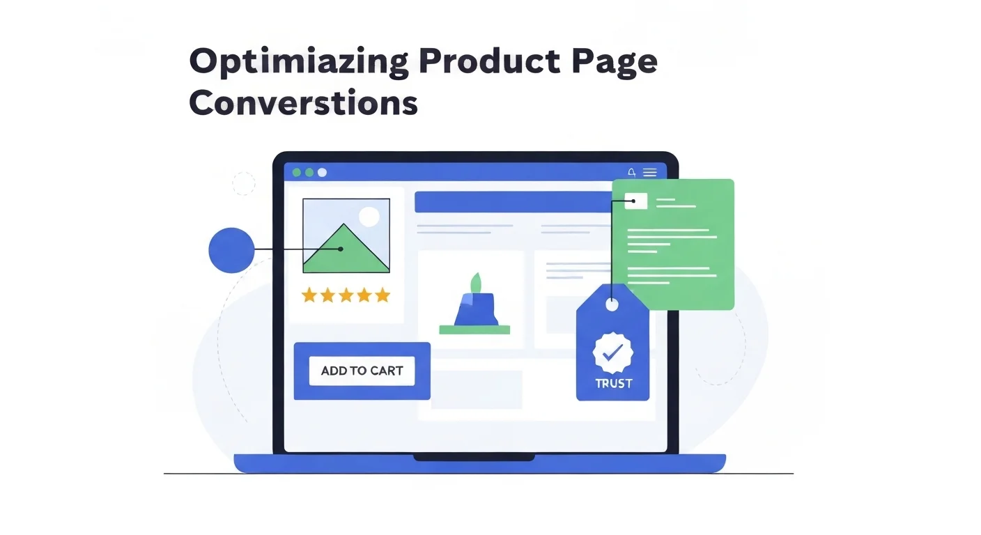
Your product page is where buying decisions are made. Paid ads, SEO, and social media can all drive traffic, but if your product page doesn't convert, none of that matters. The average Shopify conversion rate is around 1.4%. Top stores convert at 3–5% or higher. The difference usually isn't the product. It's the page.
Below are the ten most impactful optimizations you can make to a Shopify product page today, ranked roughly by conversion impact. Each one is actionable without a developer.
1. Lead With Lifestyle Product Photos
Shoppers can't pick up your product. Photos are their only sensory experience. White-background shots are necessary, but they're not what closes the sale. Lifestyle photos showing the product in context are.
A candle looks unremarkable on a white background. Photographed on a marble surface next to a glass of wine, it sells a feeling. A skincare serum photographed in a clean bathroom tells the shopper exactly who it's for.
The problem is that professional lifestyle photography costs $500–2,000 per shoot. Tools like Prodofoto generate AI lifestyle photos from your existing product images in minutes. No studio, no stylist, no photographer. It's become the practical approach for Shopify stores that want professional visuals without the budget. See our guide on lifestyle vs white background photos for the conversion data.
2. Write Descriptions That Sell Benefits, Not Features
Most product descriptions read like a spec sheet. "Material: 100% cotton. Weight: 180gsm. Available in 6 colors." That tells the shopper what it is. It doesn't tell them why they should care.
Reframe every feature as a benefit. "100% cotton" becomes "breathable fabric that stays cool all day." "180gsm" becomes "substantial enough to keep its shape after 100 washes."
Lead with the top 2–3 benefits in bullet points (mobile shoppers scan). Follow with a short paragraph adding context. Keep total word count under 300. Anything longer and conversion starts dropping.
3. Show Social Proof Above the Fold
Star ratings reduce purchase anxiety faster than any copy you can write. A product with 4.8 stars and 200 reviews converts dramatically better than an identical product with no ratings, even at a higher price.
Place your star rating and review count immediately below the product title, before the price. Don't hide it below the fold. Use an app like Judge.me or Loox to collect and display reviews automatically.
UGC photos in reviews (real customer photos) are especially powerful. They add authenticity that studio shots can't replicate. If you're starting from zero, a post-purchase email sequence asking for a photo review (small discount on the next order included) is the fastest way to build this.
4. Make the Add to Cart Button Unmissable
Your CTA button should be the highest-contrast element on the page. Not the logo. Not the product title. The button.
On mobile, make it sticky, fixed to the bottom of the screen so it's always reachable. Use action-oriented text: "Add to Cart" or "Buy Now" outperforms "Shop Now" or "Get Yours." The former creates intent clarity; the latter creates friction.
Test button color against your theme. Green, orange, and high-contrast black buttons typically outperform default blue. The specific color matters less than the contrast ratio against the background.
5. Optimize for Mobile: Test on a Real Phone
Over 70% of Shopify traffic is mobile. Your desktop preview is almost irrelevant. Pull up your store on an actual phone and go through the purchase flow yourself.
Common mobile failures: images that require pinching to see detail, font sizes under 16px, variant selectors with tiny tap targets, and checkout buttons that sit just below the fold.
Also check load time on mobile data (not WiFi). Use Google PageSpeed Insights to identify the largest culprits. Uncompressed images are almost always the #1 issue. Convert everything to WebP and compress below 200KB per image. See our full guide on product photography for mobile shoppers.
6. Use Visual Swatches for Variants
Text dropdowns ("Color: Select…") kill conversion. Visual swatches (color circles or pattern thumbnails) let shoppers see what they're getting at a glance. Shopify themes support this natively or through apps like Variant Image Automator.
More importantly: show a different product photo when each color variant is selected. A shopper clicking "Navy" needs to see the navy product, not the same hero image. This alone can add meaningful conversion lift for apparel and home goods.
7. Add a Size or Fit Guide
Sizing uncertainty is one of the top reasons for cart abandonment , and the top driver of returns. A clear size chart with actual measurements (not just S/M/L) removes this friction before checkout.
For non-apparel products, show a scale reference: a hand next to the product, or a lifestyle photo with a recognizable object for comparison. Dimension specs in the description help, but photos do it faster.
If you're seeing high return rates on a specific product, the size guide is usually where to start. Better photos showing scale reduce returns, something we cover in depth in common product photo mistakes.
8. Add Trust Badges Near the Price
Unknown brands face a trust gap. Shoppers who've never heard of you need reassurance before entering a card number. Trust badges placed near the price and CTA reduce this friction meaningfully.
High-impact badges: "30-day money-back guarantee," "Free returns," SSL lock icon, and payment provider logos (Visa, PayPal, Shop Pay). Keep them small and clean. The goal is reassurance, not decoration. A cluttered trust-badge section can look spammy and backfire.
9. Include a FAQ Section on the Page
Every unanswered question is a reason not to buy. A short FAQ section on the product page handles the most common objections before they become reasons to leave: "Will this fit in my car?" "Is this compatible with my device?" "How long does shipping take?"
Pull your FAQ questions from real sources: support ticket history, product reviews mentioning confusion, and questions in the Q&A section if you have one.
FAQs also carry SEO value. Product pages with FAQ schema markup can show expandable Q&A results in Google, taking up more SERP real estate.
10. Test Everything: One Change at a Time
Conversion rate optimization is not intuition. It's measurement. The changes above are proven patterns, but "proven on average" doesn't mean "will work for your specific product and audience."
Run A/B tests on one element at a time. Test hero image (lifestyle vs white background). Test button color. Test description format (bullets vs paragraphs). Tools like Intelligems and Shoplift make Shopify A/B testing accessible without custom dev.
Start with photos and descriptions. They have the highest variance and highest ceiling. Then layer in trust signals, CTA optimization, and mobile improvements. Check out our breakdown of what top-converting Shopify stores do differently for more patterns to test.
Quick Reference
- 01Lead with lifestyle product photos
- 02Write benefit-led descriptions, not feature lists
- 03Show star ratings above the fold
- 04Make the Add to Cart button unmissable
- 05Optimize and test on a real mobile device
- 06Use visual swatches for all variants
- 07Add a size guide or scale reference
- 08Place trust badges near the price
- 09Add a FAQ section to handle objections
- 10A/B test one change at a time
Start With the Highest-Impact Change
Product photos are the #1 lever on any product page. Prodofoto generates professional AI lifestyle photos from your existing product images. No studio, no photographer, ready in minutes.
Try Prodofoto FreeRelated Articles
Frequently Asked Questions
What is the most important element of a Shopify product page?
Product photos have the single highest impact on conversion rate. Shoppers cannot touch or try your product. Photos are their only sensory input. High-quality lifestyle photos that show the product in context consistently outperform plain white-background shots in conversion tests.
How many photos should a Shopify product listing have?
Most high-converting Shopify listings have 5–8 images: a hero shot, 2–3 lifestyle photos showing the product in use, a detail close-up, and a scale or size-reference shot. More photos reduce purchase anxiety and lower return rates.
Does page load speed affect Shopify conversion rate?
Yes, significantly. Google data shows a 1-second delay in mobile page load time reduces conversions by up to 20%. Compress all images (WebP format), avoid unnecessary apps that add JavaScript, and use Shopify's built-in CDN for assets.
How long should Shopify product descriptions be?
For most products, 150–300 words is optimal. Lead with the top 2–3 benefits in scannable bullet points, then add supporting detail in short paragraphs. Avoid walls of text. Mobile shoppers scan, they don't read.
Should I use video on my Shopify product pages?
Video drives meaningful conversion lifts for products where motion matters: fashion, beauty, gadgets, food. A 15–30 second autoplay loop showing the product in use is usually enough. Keep file sizes small to protect load speed.
What trust signals matter most on a Shopify product page?
Star ratings and review count (shown near the price), money-back guarantee badge, secure checkout icons, and real customer photos (UGC). Together these reduce the perceived risk of buying from a brand the shopper hasn't heard of.
How do I improve my Shopify product page for mobile?
Use a single-column layout, make the Add to Cart button sticky at the bottom of the screen, ensure images are at least 800px wide (Shopify handles responsive scaling), keep description text above 16px, and test tap target sizes on an actual phone.
What is the best way to show product variants on Shopify?
Use visual swatches instead of text dropdowns for color and pattern variants. Show a different product photo for each color variant so shoppers see exactly what they're buying. Always indicate when a variant is out of stock directly on the swatch.